
A brand built to carry craft, culture, and community across borders.
Kunue didn't start in a boardroom. It started with years of living inside Andean culture — learning to see its craftsmanship not as folklore, but as something genuinely rare in a world full of mass production.
The founding insight was simple but well-researched: there is a real, underserved market in the United States for high-quality, culturally rooted handcrafted goods from South America. Not novelty imports, not tourist-grade souvenirs — but honest craft with materials, story, and intention behind it.
Once the numbers validated the gut feeling, the next move was to test before scaling. An initial inventory run, an Etsy storefront, and zero advertising spend later — over half the inventory had sold, entirely through organic discovery. The market wasn't just theoretical.
"We analyzed the numbers and it was actually plausible
— so we got to it."
Naming a brand that lives between two worlds — Andean roots and an American market — required a word that could hold both without favoring either.
The result is a name that sounds unfamiliar enough to spark curiosity, but natural enough to be remembered. It doesn't explain itself — it invites the question.
The early Etsy data confirmed what intuition already suggested: the Kunue customer is not concentrated on the coasts. They live in places where the seasons are real, where heritage matters, where a poncho made from alpaca wool in the Andes is genuinely meaningful — not just aesthetically interesting.
The result is a name that sounds unfamiliar enough to spark curiosity, but natural enough to be remembered. It doesn't explain itself — it invites the question.
The Kunue icon is one of those rare marks that works on multiple registers simultaneously. Read it one way: mountain peaks — the Andes, the terrain where every product originates. Read it another: condor wings spread mid-flight, the symbol embedded in the brand's very name. Read it a third: a geometric "K" abstracted into something timeless.
The diamond at the crown reinforces the dual reading — snow-capped peak or condor's body — while adding a sharpness that keeps the mark from feeling folkloric. This is not a brand that leans on ethnographic clichés. It uses cultural reference as structure, not decoration.
The wordmark in clean, rounded lowercase grounds the icon in something approachable and contemporary. The combination signals: this brand knows where it comes from, and it knows where it's going.




Application versatility
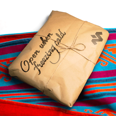
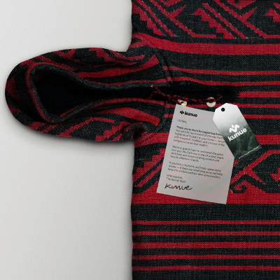
Horizontal lockup · Stacked lockup · Vertical wordmark · Icon-only. Built to work at every scale — from care labels inside a poncho to a full e-commerce storefront.



Color palette
Deep forest green as the primary — not tropical, not lime, but the muted green of Andean cloud forests and highland altitude. Paired with a golden beige color for flexibility and black for precision.
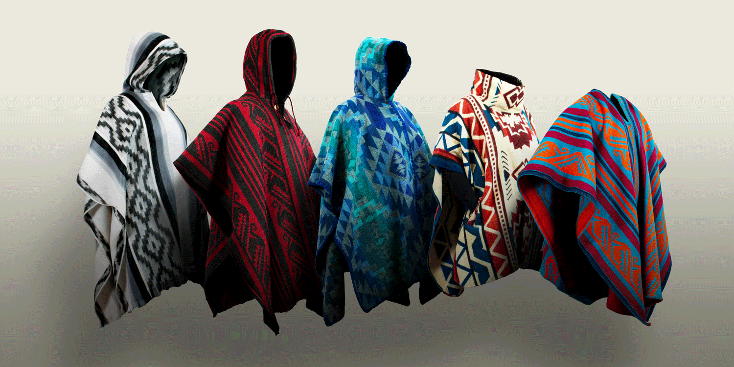
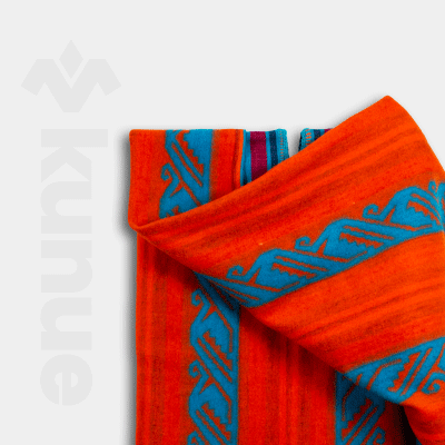
Kunue currently carries alpaca wool ponchos, sheep's wool ponchos, and native textile hoodies and windbreakers — all sourced directly from small producers in Ecuador. But the strategic direction goes further than curation.
"The idea is to get producers to create under our brand and some guidelines — but the creative vision stays theirs."
This model positions Kunue not as a brand that extracts from Andean craft culture, but as a platform that amplifies it. Fair trade principles, community integration, and producer storytelling are built into the roadmap — not added as an afterthought.
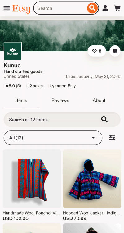
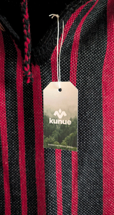

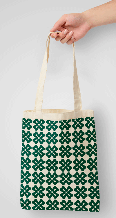

The proof of concept is done. The brand exists, the product is real, and the market has responded without being asked to. The next phase is about building the infrastructure to scale what already works.
