
A Texas-based real estate platform serving the Hispanic community needed more than a logo refresh. They needed a brand that could carry a mission.
Terratino started as a home search engine and grew fast — adding finance services, realtor tools, marketing support, and more. The problem was that the brand didn't keep up. Every new service came with a new visual direction, and the result was inconsistency that quietly eroded trust with the very community they were trying to serve.The Hispanic community faces real barriers to homeownership — language, financial literacy, and institutional distrust. Terratino was built to break those barriers down. But a brand that couldn't communicate consistently was working against its own mission.
"The goal wasn't to look better. It was to finally look like one company — and earn the trust of a community that had every reason to be skeptical."
The work began with a full brand audit: what the brand was communicating versus what the company actually stood for, and what had to change to close that gap. This phase — the thinking — shaped everything that came after.
Before a single pixel moved, we built the strategic foundation — a CMO Vision document that defined Terratino's brand position, values, target audiences, and communication principles. That document became the filter for every decision that followed.
The original logo had gone through four iterations in a short period — a symptom of reactive identity work. We preserved the brand's DNA while creating a mark flexible enough to adapt across services and contexts, from Terratino Homes to Terratino Pro to Terratino Marketing
Logo evolution (Before):


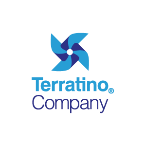
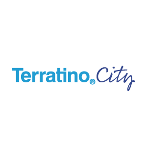
After:


A single palette wasn't enough for a company with this many arms. We segmented the color system into three containers: corporate (monochrome, legal contexts), public brand (teal, gray, white), and sub-brands (a distinct color per service). Each department got a color employees voted on and named themselves — building ownership into the visual identity from the start.








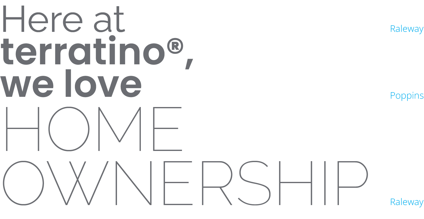
Raleway for editorial warmth. Poppins across weights for hierarchy and flexibility — from ultra-thin display headings to semi-bold UI labels. The type system was designed to scale across every surface: website, social, print, and brand collateral.
We developed a proprietary illustration style rooted in flat design, then evolved it into something more intentional — freehand strokes and deliberate imperfection that reflect the humanity of every homebuying story. No two cases are the same. The illustrations say that visually, without needing words.





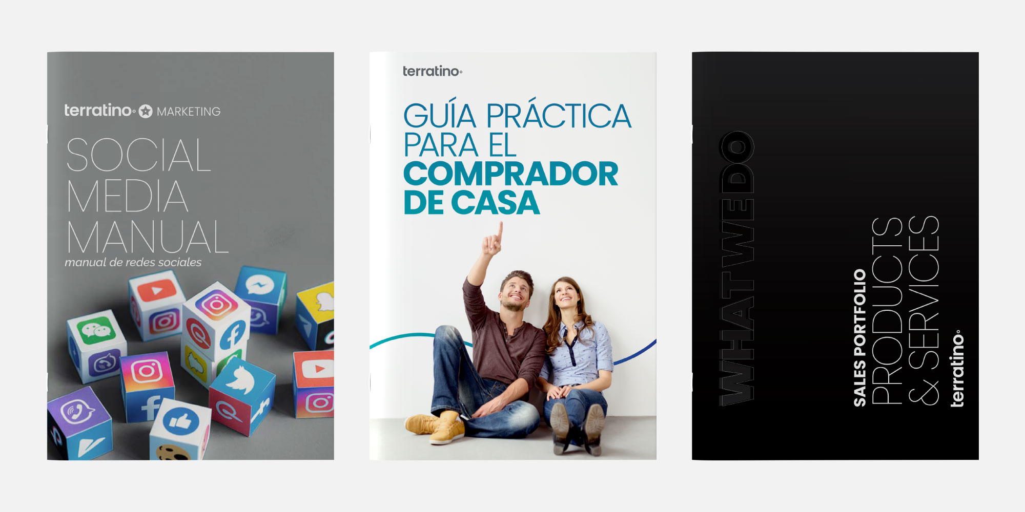
Everything came together in a comprehensive brandbook — logo usage, color system, typography, illustration guidelines, photography direction, tone of voice, and application examples across print, digital, and physical touchpoints. The brandbook isn't a rules document. It's a cultural artifact — the brand’s soul and operating system in one place.

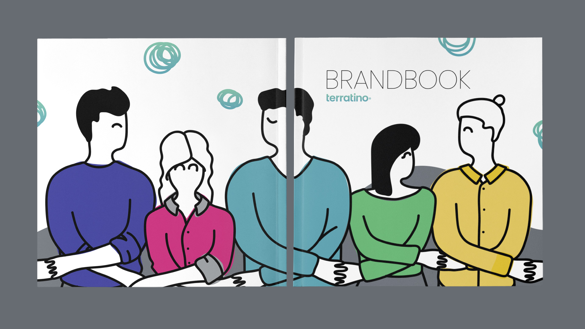
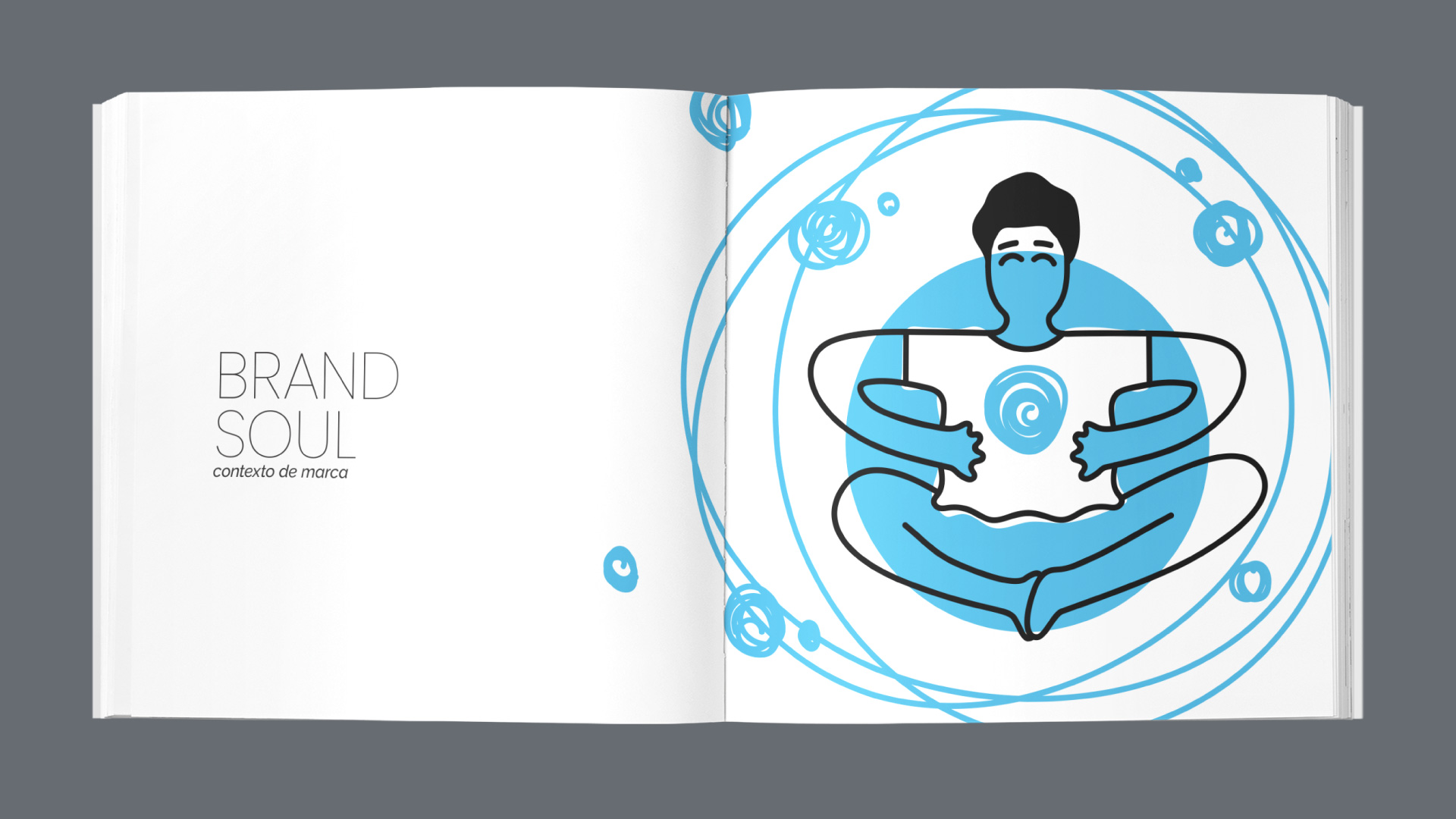
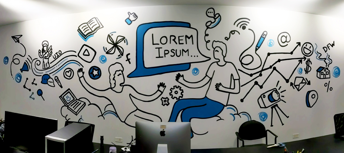
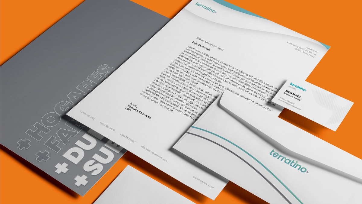
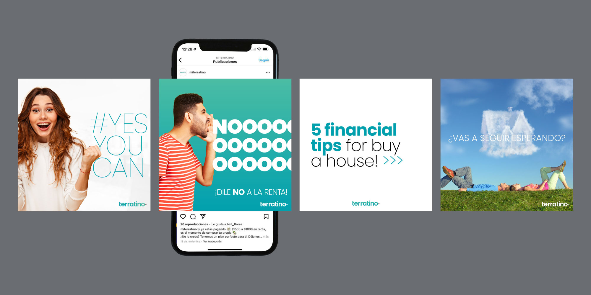
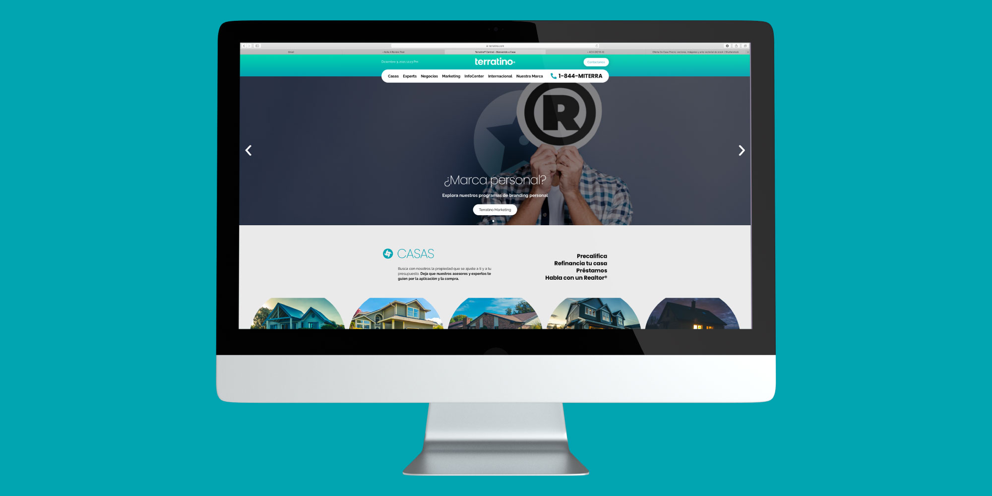
The new identity gave Terratino something it didn't have before: consistency. Every touchpoint — from social posts to business cards to office murals — spoke the same visual language. That consistency built recognition, and recognition built trust.
The brand's social presence went from scattered to strategic. Content that used to feel generic started resonating. The real estate professionals in the Hispanic community started paying attention — not just as clients, but as partners.
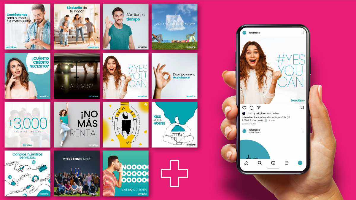
Growth across every metric that matters — affiliated experts, clients served, and total impressions — all moving in the right direction after the rebrand. The team expanded to meet demand. Revenue followed.
