
A full pet care ecosystem in the making needed a brand big enough to hold the whole vision — starting with the one service nobody else was doing right.
Zoobamba started as a vision over four years in the making: a full pet care ecosystem built around the owner who treats their animal like family. Hotels, daycare, grooming, refuge — a whole experience designed from the ground up for pets, not retrofitted from whatever space was available.
The problem? Building all of that takes capital. So instead of launching small and looking small, the strategy was to enter through the one gap that nobody else was filling — specialized veterinary medications. The conditions nobody stocks. The treatments for cardiac, hepatic, and pancreatic disease that vets diagnose but can't find. If the first stage is done right, it builds the trust, the revenue, and the relationships to make the rest possible.
The pet care category is full of names that describe exactly what they do — and nothing more. Pet this, animal that, mascota something. The name needed to be interesting without being obvious, rooted without being generic, and big enough to hold a future that goes well beyond pharmacy.
Once the name was locked, the identity followed with clarity. A name like Zoobamba is chunky, confident, a little unexpected — the visual system had to match that energy.
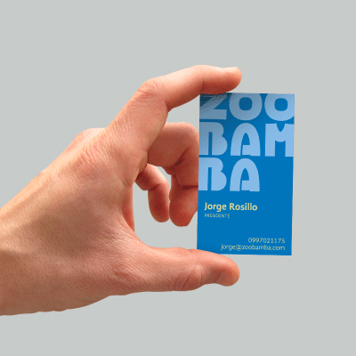
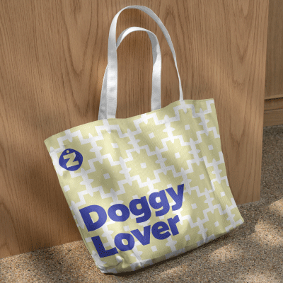
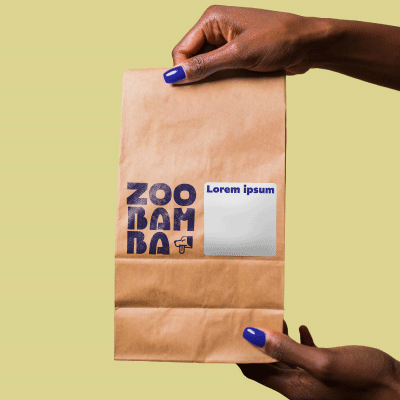
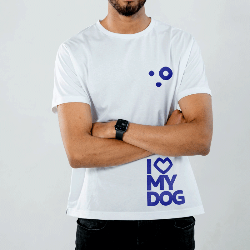
The wordmark does the heavy lifting. A reinterpretaition of REM's geometric weight gives Zoobamba the bold, stacked presence the name demands — three syllables, three lines, no apology. The Z-tag icon distills the whole brand into a single mark: the brand's initial, inside a pet collar tag. Familiar object, unexpected execution.



Typography -
Two typefaces, one job each.
REM handles everything that needs to command attention — headlines, the wordmark, anything that needs to hit first.
Gandhi Sans handles everything else — warm, legible, unhurried.
Together they hold both registers without fighting each other.
Color Pallette -
The palette was built around a real constraint: dogs don't see the full color spectrum. Blues and yellows dominate their visible range — so the color system was designed within those boundaries.
It's a decision that sounds like a gimmick until you understand why. Then it becomes one of the most intentional calls in the whole brand.
The physical location in Quito tells the story before a word is spoken. Sky-blue walls covered in hand-drawn pet illustrations — the same illustration system from the identity kit, scaled up and painted directly onto the surface. The brand doesn't just live on the shelf. It lives in the room.
A pre-launch content strategy for month one was built in parallel: twelve posts across four weeks, three content pillars, two audience registers, and a full caption and hashtag system. The content doesn't announce the brand — it earns trust before the doors open.










"The brand had to be bigger than the business we're launching.
Because the business we're launching isn't the one we're building."
